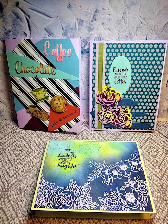
Hello my crafty peeps! HAPPY FRI-YAY!!! Well, it's taken me three days to get this blog post up, but hey, I think you'll agree it was worth the wait. This is my first official blog post to follow up from my Stampin' Up! Facebook live show!!! Yeay!! The descriptions for these cards are not going to be as in depth as my previous project card posts because this post is only featuring the finishing touches I added to complete these cards. Please head over to my Facebook page at Stamp The Fun UP to watch the videos from 03/24/2021 on the inking techniques used in these cards.
This first card, featuring sunset roses created by using blended inks thru stencils created by die cuts, is a standard A2 card. The roses were created with colors from the warm side of the color wheel, so I chose colors from the cool side of the color wheel to create this card for them. The card base is purple posy. I cut a layer from 6"x6" 2019-2021 In Color designer series paper. I love layers of color and texture so I took purple posy wide ribbon from the Playing With Patterns ribbon pack and layered old olive ribbon from the Ornate Garden ribbon pack over it. I offset this to the folded edge of the card. I used the roses and dies from the Brushed Blooms bundle primarily for this card, and in the die set is an odd die that cuts out random artsy-fartsy rectangles.
I never thought I'd use this die but this card just screamed for it. I used night of navy cardstock with the die and stair stepped three of the shapes at the bottom of the card. Now I adhered the roses: the large bottom one is glued flat, the large top one and the small middle one are both on dimensionals to give the composition depth. The sentiment is from the Waterfront stamp set, and is stamped in night of navy onto a die cut from the Layering Ovals die set.
The second card was very simple embellished because the inking technique basically was all the decoration this card needed. The sentiment is stamped in night of navy ink again from the Waterfront stamp set. I loved this card but it didn't quite feel finished. I though of doing some tone on tone single flowers around the sentiment but noticed, in the Waterfront set which I never really use much, there was a stamp my original partner in paper-crafting crime would call "fly poop".
It's basically just a bunch of tiny speckles. lol, I knew instantly I wanted to add some of her inspiration to this card so I stamped the "fly poop" all around the sentiment in balmy blue ink. I think that finished it off perfectly.
The last card's ink technique was the ombre effect on the "Coffee" and "Chocolate" sentiments from the Nothing's Better Than bundle. This set always gives me a retro vibe so I went nuts with scraps of drab cardstock in clashing colors, cut them in random shapes and glued them to a purple posy card base.
I stamped and colored the coffee cup, candies and cookie with the blends, and of course the coffee cup had to be "Avacado" green which the old olive blends are very similar too. I also used the "you deserve it" sentiment from the Brushed Blooms stamp set, again in night of navy.


.jpeg)
Comments
Post a Comment